Three directions for The Fix Salon
This is a proposal, not a live site. Every photo, colour and line of copy below is from The Fix — the same brand serif, the same salon, the same 4.9-star record. What changes is the point of view. Pick the letter that feels like the salon you think you run; the whole site gets built in that direction.
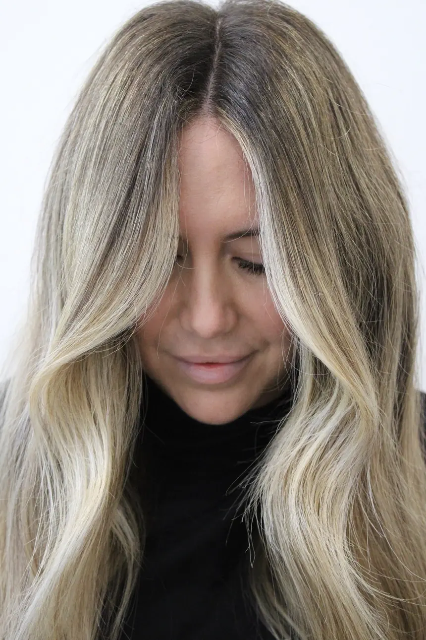
Editorial Atelier
Fashion-magazine restraint. Type is the hero, photography is the counterweight, and empty space does the luxury signalling. Reads expensive and quiet.
Beautiful blondes,
seamless extensions,
hair you recognise
as your own.
A consultation before a colour. A plan before a cut. Fourteen stylists who will tell you the truth about your hair.
What it commits to
Restraint as the luxury signal. Big type, few words, one photograph at a time. It would make the salon feel like the most considered room in Little Rock.
What it costs
It needs excellent photography to carry the silence, and it hides the warmth of the team. A first-time client looking for reassurance may find it aloof.
Warm Architectural
Built around the room you actually have — walnut slats, polished concrete, west light. Terracotta is already your brand colour. Sells the experience, not just the result.
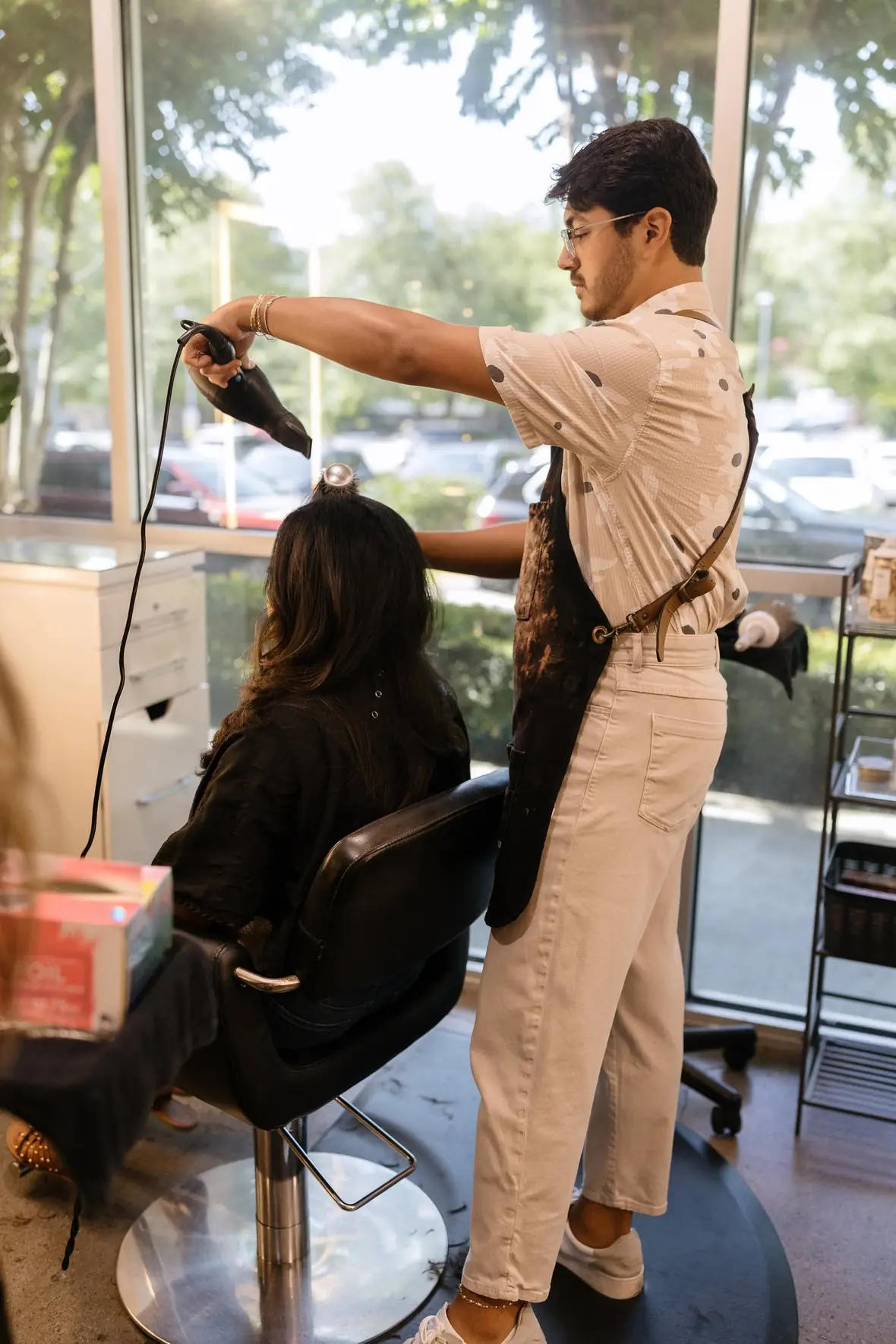
Sit down. We'll take it
from here.
Floor-to-ceiling light, a chair that's yours for the afternoon, and a stylist who plans your hair a year out — not one appointment at a time.
What it commits to
Your room as the differentiator. No other salon in Little Rock looks like this, and it is the thing reviews actually mention — "such a vibe," "sleek, modern, clean." It carries social proof and both calls-to-action naturally.
What it costs
It leans on interior photography, so the hair work has to earn its place further down the page. Less overtly high-fashion than A or C.
High-Contrast Luxe
Near-black canvas, hair lit out of the dark, brass hairlines. The most overtly expensive of the three — closest to a luxury beauty house.
The best blonde
in Arkansas is
not an accident.
Hand-tied wefts, keratin bonds and toppers, placed by artists who do nothing else. Consultation first, always.
Reserve your chair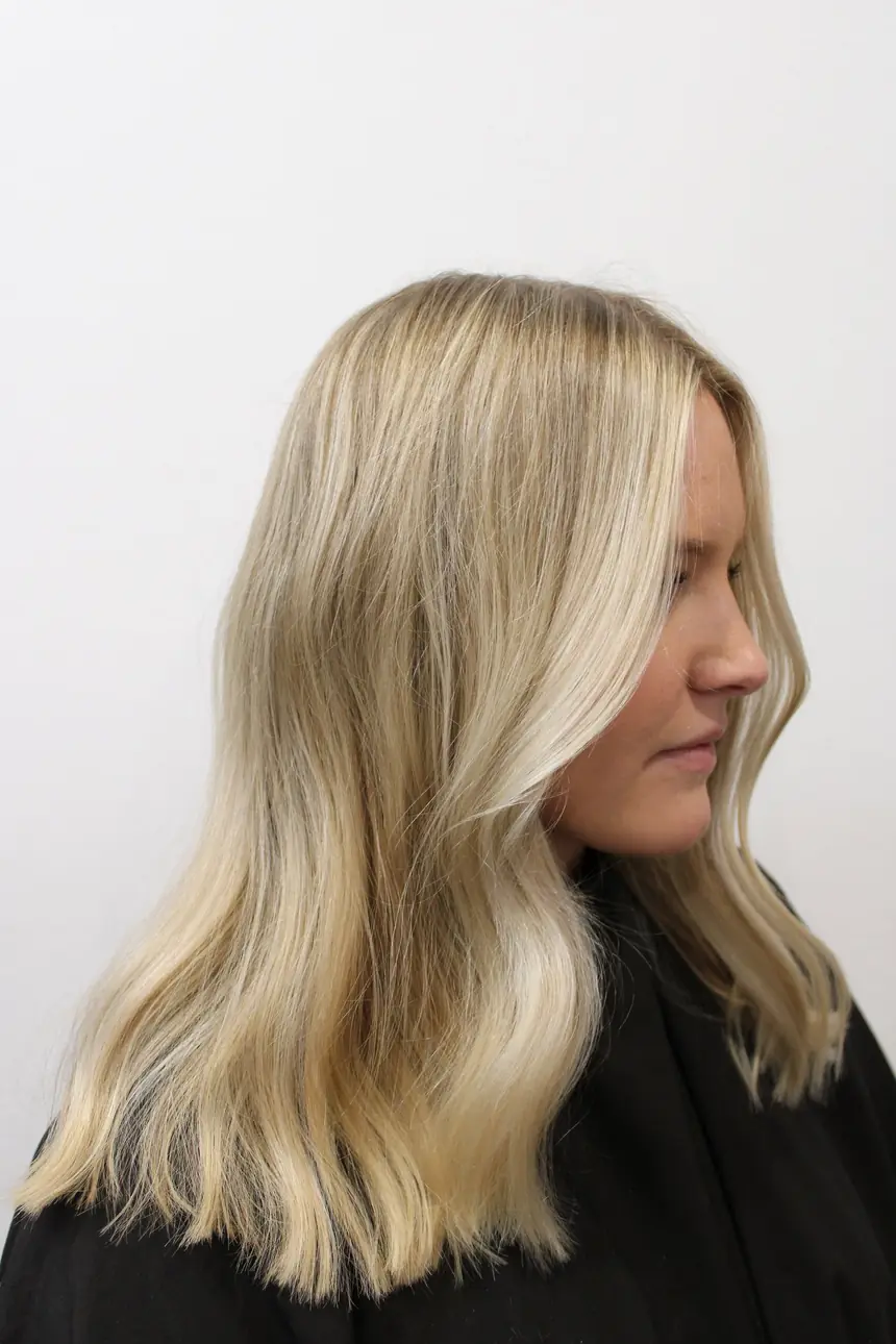
Keratin bonds
Toppers
What it commits to
Authority. Dark grounds make hair glow, and the numbers do the talking. This is the direction that would let you raise prices without anyone blinking.
What it costs
Dark sites can read cold for a neighbourhood salon, and they are unforgiving of inconsistent photography. It flatters blondes least — the very thing you are known for.
Which one, and why it matters
The direction decides everything downstream: the type scale, how the gallery is cropped, how stylists are introduced, where the booking button sits. It is much cheaper to choose now than to change later.
We've got a California vibe and an industrial design that's distinctly unique and modern. While the look of the salon sets the tone for a high-end experience, it's our friendly, personal, and attentive service paired with our highly talented styling team that makes The Fix Salon one of a kind.
The recommendation
B — Warm Architectural, led by people rather than the empty room.
Your own description settles it twice over. "California vibe and industrial design" is a material spec — warm wood, concrete, daylight — and that is direction B. It also rules out C: near-black and brass is a New York vocabulary, and it contradicts California.
The second half matters more. "While the look sets the tone… it's our service and our styling team that makes The Fix one of a kind" — that is a hierarchy. The room is the frame; the people are the subject. So B gets built with your stylists in that room, not the room alone.
Which points at the biggest single gap on the current site: fourteen stylists, and not one of them has a bio. The thing you say makes you one of a kind is the thing the website leaves blank. Fixing that is both the design answer and, as it happens, the best search traffic available to you.
To respond, just send back a letter — A, B, C, or "B with A's type". That is the only decision needed to start.
Independent design study prepared for discussion. Not affiliated with, commissioned by, or endorsed by The Fix Salon; the live site is fixsalonar.com. Photography and brand marks belong to The Fix Salon and are used here only to show how their own assets could be presented. The three screens above are non-functional concepts — no booking, no payment, nothing is collected.